The examples on this page will work now in Firefox, Safari, Chrome, Opera and Internet Explorer 10. In older browsers you will see either no effects, or the transforms taking place without any animation.
The animations presented below involve setting up atransformation to take place in response to a mouseover or other event. Then, rather than applying the effect instantly, we assign a transition timing function which causes the transformation to take place incrementally over a set time period.
There are also other kinds of animation available, including @keyframes for perpetual motion, andrequestAnimationFrame which gives complete control over the timing and path. These are covered in separate articles.
Firefox and Opera now support these transforms with an almost identical syntax - just replace -webkit- with -moz- or -o- in the examples below.
Internet Explorer 10 supports transitions with no prefix. In IE10 Preview the -ms- prefix was required for transitions. Transforms in all versions of IE10 still require the prefix.
To support all modern browsers, the following styles should be used for transitions:
- -webkit-transition
- -moz-transition
- transition
and for transforms:
- -webkit-transform
- -moz-transform
- -ms-transform
- transform
We've omitted the -o- prefix because Opera now recognises the WebKit styles.
1. Introducing CSS Transformations
The effect of a CSS Transform is to modify the appearance of an element in the browser by translation, rotation or other means. When defined in a style sheet, transformations are applied as the page is rendered, so you don't actually see any animations taking place. Transforms can also be applied as a mouseover or similar effect which you can see in the next section.
Apple's proposal for CSS Transformations calls for the ability to change the perspective and work in three dimensions, but that's some way away yet. Even the features demonstrated here won't appear in other browsers until they're approved by the standards body who are still quibbling over CSS3 modules.
Below we've placed four identical DIV's styled as a 100 x 60 pixel box with a 2 pixel border. Subsequently, each element has been transformed in some way using the transform property:
| box 1 | Translated to the right: transform: translate(3em,0); |
| box 2 | Rotated 30 degrees with the clock: transform: rotate(30deg); |
| box 3 | Translated to the left and down: transform: translate(-3em,1em); |
| box 4 | Scaled to twice its original size: transform: scale(2); |
box 1
box 2
box 3
box 4
The HTML and CSS code for this example is as follows:
<style type="text/css">

  .showbox {
    float: left;
    margin: 4em 1em;
    width: 100px;
    height: 60px;
    border: 2px solid green;
    background-color: #fff;
    line-height: 60px;
    text-align: center;
  }

</style>

<div class="showbox" style="transform: translate(3em,0);">box 1</div>
<div class="showbox" style="transform: rotate(30deg); border-color: red;">box 2</div>
<div class="showbox" style="transform: translate(-3em,1em);">box 3</div>
<div class="showbox" style="transform: scale(2);">box 4</div>
<div style="clear: left;"></div>
Without the translations, and the red border on the second box, you would see just four identical boxes labelled one through four. What you see in supported browsers (Safari, Chrome, Firefox, Opera), however, will be more like this:

Of note is the fact that the text is still selectable in transformed elements, even when rotated, and that scaling an element affects properties including border widths and font sizes and not just the box dimensions.
2. Animating your Transforms
While CSS Transformation in itself is a powerful tool for developers (though I shudder to think what will happen as it becomes more widely used), the ability to animate the same effects using-webkit-transition is far more exciting. Move your mouse over the following four boxes for a demonstration:
box 2
box 4
What you see above is the four boxes from the previous section, in their default states. When you mouseover any of the boxes, however, the CSS transformation is applied as a one second animation. When the mouse moves away the animation is reversed, taking each box back to its original state.
And we can do this without using JavaScript - only HTML and CSS! Here is the complete code for 'box 1' which slides to the right and back:
<style type="text/css">

  .showbox {
    float: left;
    margin: 4em 1em;
    width: 100px;
    height: 60px;
    border: 2px solid green;
    background-color: #fff;
    line-height: 60px;
    text-align: center;
    -webkit-transition: 1s ease-in-out;
    -moz-transition: 1s ease-in-out;
    -o-transition: 1s ease-in-out;
    transition: 1s ease-in-out;
  }
  .showbox.slideright:hover {
    -webkit-transform: translate(3em,0);
    -moz-transform: translate(3em,0);
    -o-transform: translate(3em,0);
    -ms-transform: translate(3em,0);
    transform: translate(3em,0);
  }

</style>

<div class="showbox slideright">box 1</div>
If you think that's cool, realise that CSS Animation can be applied not just to the transforms, but also to other CSS properties including: opacity, colour and a bunch of others.
In the next example the box on the left begins as small and green with square corners, while the one on the right is larger, with a red border and rounded corners. Hovering over either of the boxes will trigger an animation that makes box 1 take on the appearance of box 2 and vice versa.
box 1
box 2
Again, we're still only using HTML and CSS to make this happen. Without CSS Transforms the two boxes will still change their border-color, and possibly also the border-radius, but it happens immediately rather than as a one second animation.
For more advanced examples you can read our new article on using JavaScript to trigger the animation. And for an alternative to CSS transitions, and finer control over the animation paths and timing, you can use Window.requestAnimationFrame.
3. Multiple Transforms on one element
To apply more than one transformation to a single element simply list them one after another separated by spaces. The submenu for example at the top right of this page has the following styles:
<style type="text/css">

  #submenu {
    background-color: #eee;
    -webkit-transition: 1s ease-in-out;
    -moz-transition: 1s ease-in-out;
    -o-transition: 1s ease-in-out;
    transition: 1s ease-in-out;
  }
  #submenu:hover {
    background-color: #fc3;
    -webkit-transform: rotate(360deg) scale(2);
    -moz-transform: rotate(360deg) scale(2);
    -o-transform: rotate(360deg) scale(2);
    -ms-transform: rotate(360deg) scale(2);
    transform: rotate(360deg) scale(2);
  }

</style>
Note that IE10 now uses no prefix for transitions, but -ms- is still required for transforms.
This means that when you hover over the submenu, it will change colour, rotate and double in size over a period of one second as shown here:
 | <=> |  |
These effects are now available in the latest public release of Safari, so in principle all OSX users will be able to see these effects. Whether it's a good idea to add them to your website I'll leave up to you.
Thanks to misterbisson those without WebKit can now see a screencast of the menu animation:
4. Animations in action
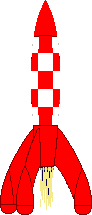
Now here's another example of the kind of fun we can have in combining different effects into single animation. Perhaps you can already work out what's going to happen based on the CSS?
<style type="text/css">

  /* initial state */
  #outerspace {
    position: relative;
    height: 400px;
    background: #0c0440 url(/images/outerspace.jpg);
    color: #fff;
  }
  div.rocket {
    position: absolute;
    bottom: 10px;
    left: 20px;
    -webkit-transition: 3s ease-in;
    -moz-transition: 3s ease-in;
    -o-transition: 3s ease-in;
    transition: 3s ease-in;
  }
  div.rocket div {
    width: 92px;
    height: 215px;
    background: url(/images/rocket.gif) no-repeat;
    -webkit-transition: 2s ease-in-out;
    -moz-transition: 2s ease-in-out;
    -o-transition: 2s ease-in-out;
    transition: 2s ease-in-out;
  }

  /* hover final state */
  #outerspace:hover div.rocket {
    -webkit-transform: translate(540px,-200px);
    -moz-transform: translate(540px,-200px);
    -o-transform: translate(540px,-200px);
    -ms-transform: translate(540px,-200px);
    transform: translate(540px,-200px);
  }
  #outerspace:hover div.rocket div {
    -webkit-transform: rotate(70deg);
    -moz-transform: rotate(70deg);
    -o-transform: rotate(70deg);
    -ms-transform: rotate(70deg);
    transform: rotate(70deg);
  }

</style>
and the HTML:
<div id="outerspace">
<div class="rocket">
<div><!-- rocket --></div>
.rocket
</div>#outerspace
</div>
Put them together and this is the what you get:
If you're using Safari 3 you may notice some problems with the animation, particularly when it reverses after you move the mouse away, but in the latest version of WebKit it's already much smoother. Also the animation in Opera is a bit erratic, with not all the elements being animated.
The dotted outline that appears during the animation shows the placement of the DIV containing the rocket image. This DIV translates across the screen while the image inside is rotated. Simple!
For the browser-impaired what's happening is that when you move the mouse over the space background, the rocket translates from the bottom left to the top right over a period of 3 seconds (translate()) and also rotates 70 degrees in a clockwise direction over the first 2 seconds (rotate()). The effect is rudimentary, but shows the potentional.
To have more control over the animation paths and timing, you can set up WebKit Keyframes. They also allow the animations to run automatically, and continuously, rather than just in response to mouse events.
5. Multiple timing functions
#stage
#block
In this example we are applying four different transitions using four different timing functions.
When you :hover over the area to the right the blue box will spin, change color from red to blue and move from the top left of the containing box to the bottom right over two seconds.
The first thing you will notice is that that the movement of the box appears to be curved rather than straight. That's because we've used the ease-out timing function for the horizontal translation and ease-infor the vertical.
To animate over an actual curved path, or even an arbitrary path, you will need to use JavaScript to control the animation.
During the animation, the colour change from blue to red takes place over the first second of the two second transition, followed by the rotation which takes place over the second second.


The trick to this is that instead of defining the -webkit-transition as a single property, you can break it up into component parts. We've also made use of -webkit-transition-delay which allows you to set the starting point of different effects.
Here are the relevant CSS statements:
<style type="text/css">

  #block {
    ...
    left: 0;
    top: 0;
    ...
    background: blue;
    ...
    -webkit-transition-property: left, top, background, -webkit-transform;
    -webkit-transition-duration: 2s, 2s, 1s, 1s;
    -webkit-transition-timing-function: ease-out, ease-in, linear, ease-in-out;
    -webkit-transition-delay: 0, 0, 0, 1s;
    ...
  }
  #stage:hover #block {
    left: 100px;
    top: 100px;
    background: red;
    -webkit-transform: rotate(360deg);
   ...
  }

</style>
The rules affecting the background colour transition have been highlighted. They take place over the first second (0s delay, 1s duration). The rotation transform takes place in the next second (1s delay, 1s duration).
For other browsers the -webkit- prefixed styles need to be repeated and the prefix replaced with -moz-, -o- and -ms-. With the exception that *transition* requires no prefix for Internet Explorer 10 and higher.
Firefox requires units to be specified even for zero values in -moz-transition-delay, so0s, 0s, 0s, 1s will work for the example above.
6. Hover over one element to affect another
A couple of people have asked about triggering animations in relation to a click or hover event elsewhere on the page. With JavaScript this can be done by using an event handler to set or change the className of the element to be animated, and to have a transformation or keyframes associated with the new class.
Using CSS there are some options for targeting related elements. These involve selectors such as the >(child), + (adjacent sibling) and ~ (general sibling) combinators.
The preceding examples all required a direct hover event either on the element itself or on its container, wheras in this example the blue box is animated only when you hover over its sibing, the red box:
#box1
#box2
#stage2
The relevant CSS code is as follows. Note that we are using the + adjacent sibling combinator to target#box2 when #box1 experiences a hover event. The ~ combinator may be more flexible in letting you target elements that are further away from the triggering element (some examples).
<style type="text/css">

  #box2 {
    position: absolute;
    left: 120px;
    ...
    background: blue;
    ...
    -webkit-transition: 1s ease-in-out;
    -moz-transition: 1s ease-in-out;
    -o-transition: 1s ease-in-out;
    transition: 1s ease-in-out;
  }
  #box1:hover + #box2 {
    -webkit-transform: rotate(360deg);
    -moz-transform: rotate(360deg);
    -o-transform: rotate(360deg);
    -ms-transform: rotate(360deg);
    transform: rotate(360deg);
    left: calc(100% - 102px);
    background: yellow;
  }

</style>
Internet Explorer 11 fails trying to animate when the values have been assigned usingcalc(). You will need to use a fixed value instead.
Of course we can still animate the first box at the same time as targeting it's sibling or siblings:
#box3
#box4
#stage3
Just be sure not to move the hovered element out from under the pointer or the animation will stop/reverse.
These examples work more or less as intended in WebKit (Safari, Chrome), Firefox and Opera browsers. They also work in Internet Explorer 10.
7. Controlling the reverse animation
In all the examples above you may have noticed some strange effects when the animation is reversed - particularly when the mouse moves away from the trigger area before the animation has completed.
The box in the animation below will rise up slowly and then shoot off to the right useing an extremecubic-bezier timing function, making it start off quickly and then slow down at the end.
When you move your mouse away it will not track back over the same path, as the vertical animation will come first, and the box will move quickly from right to left before slowing down.
#box
The CSS for this is as follows:
<style type="text/css">

  #stage {
    position: relative;
    height: 4em;
    background: #efefef;
    text-align: center;
  }
  #box {
    position: absolute;
    left: 0;
    bottom: 0;
    width: 100px;
    background: red;
    line-height: 2em;
    color: #fff;
    -webkit-transition: 1s bottom, 4s 1s left cubic-bezier(0,1,1,1);
    -moz-transition: 1s bottom, 4s 1s left cubic-bezier(0,1,1,1);
    -o-transition: 1s bottom, 4s 1s left cubic-bezier(0,1,1,1);
    transition: 1s bottom, 4s 1s left cubic-bezier(0,1,1,1);
  }
  #stage:hover #box {
    left: calc(100% - 100px);
    bottom: 2em;
  }

</style>
We can, however, control the animation in both directions. In this case causing the animation to perform everything in reverse:
#box
The trick is to move to original transition settings to the :hover statement and for the 'non-hover' to use a transition that reverses them:
<style type="text/css">

  #stage {
    position: relative;
    height: 4em;
    background: #efefef;
    text-align: center;
  }
  #box {
    position: absolute;
    left: 0;
    bottom: 0;
    width: 100px;
    background: red;
    line-height: 2em;
    color: #fff;
    -webkit-transition: 1s 4s bottom, 4s left cubic-bezier(1,0,1,1);
    -moz-transition: 1s 4s bottom, 4s left cubic-bezier(1,0,1,1);
    -o-transition: 1s 4s bottom, 4s left cubic-bezier(1,0,1,1);
    transition: 1s 4s bottom, 4s left cubic-bezier(1,0,1,1);
  }
  #stage:hover #box {
    left: calc(100% - 100px);
    bottom: 2em;
    -webkit-transition: 1s bottom, 4s 1s left cubic-bezier(0,1,1,1);
    -moz-transition: 1s bottom, 4s 1s left cubic-bezier(0,1,1,1);
    -o-transition: 1s bottom, 4s 1s left cubic-bezier(0,1,1,1);
    transition: 1s bottom, 4s 1s left cubic-bezier(0,1,1,1);
  }

</style>
This can be useful for button and menu effects to make an element on the page appear quickly and then fade out slowly, or vice versa.
Remember that the transitions set in the :hover statement are the ones that will be used as the hover state is applied. The 'default' transition settings will be used when returning to the default state.
No comments: